
Kentucky’s homegrown Covid update published last Monday evening, September 19, might be interpreted as demonstrating an easing of the Commonwealth’s share of the pandemic. There was only a very small uptick in new weekly cases with more marked decreases in the Test Positivity Ratio and the Overall Case Incidence Rate. Nonetheless, a lack of concordance of these three interconnected metrics highlights the sorry state of data collection that is badly needed both nationally and in Kentucky. We are most assuredly behind the timeline in assessment of disease activity.
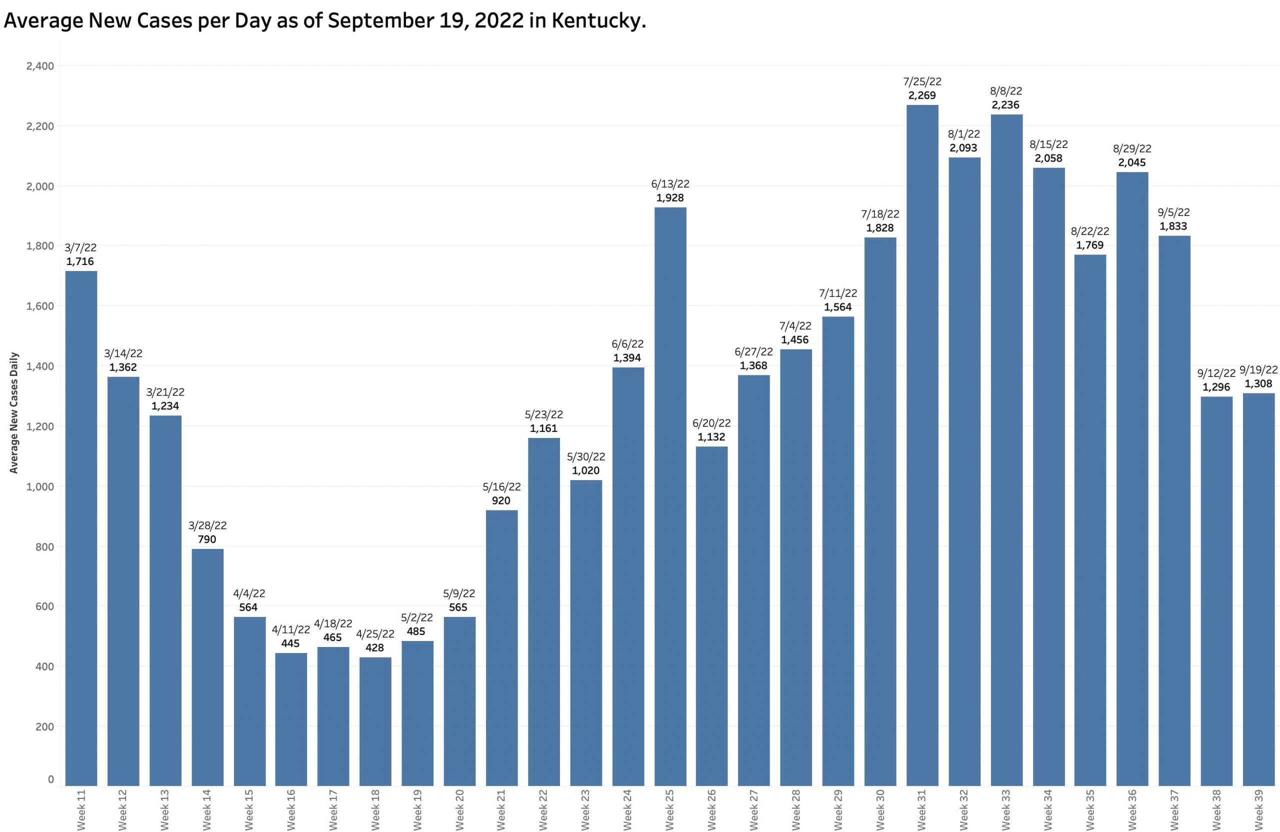
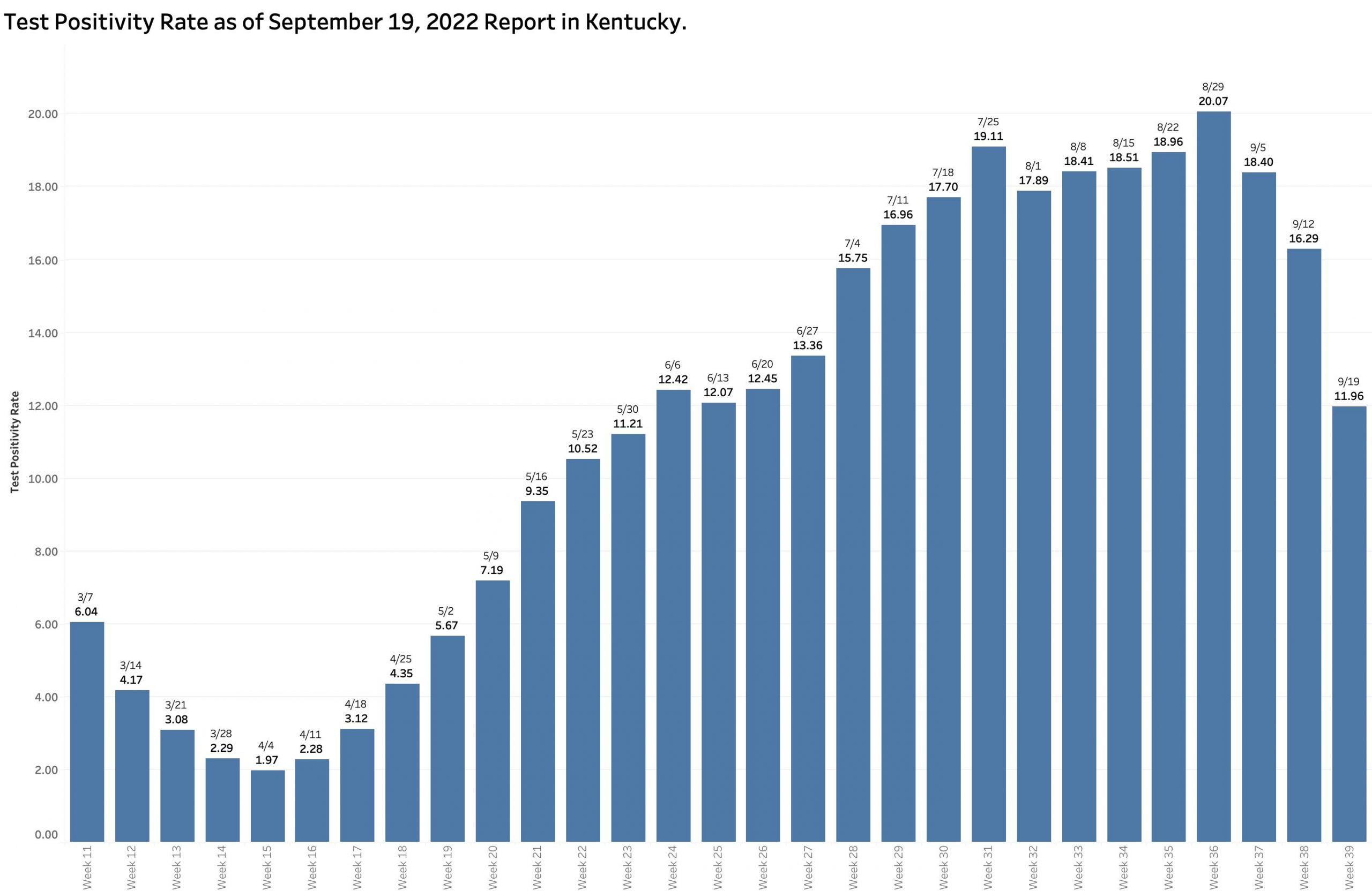
I recently expressed the widely observed concern that delayed case and hospital reporting following a major long weekend holiday would be followed by compensating catchup numbers. This has been the case earlier in Kentucky. Monday’s report of 9159 new cases was in fact higher than the previous week’s, but only by 85 cases– a 6.6% increase. I was therefore surprised to see the Test Positivity Rate fall by 26.6% from 16.3 to 12.0%. In the same direction, the Overall Incidence Rate across the state continued its dramatic 4 week fall from the high of 47.0 cases per 100K population in the report of August 29. In the past week alone the Incidence rate fell a further 25.6% from 27.0 to 20.1 per 100K. In my head, this does not yet compute because the formulas used to calculate both the later two metrics are based on new case counts.
Test Positivity Rate (TPR).
According the Kentucky Department of Public Health (KDPH), “Positivity rate is calculated using electronically submitted PCRs from the past seven days.”
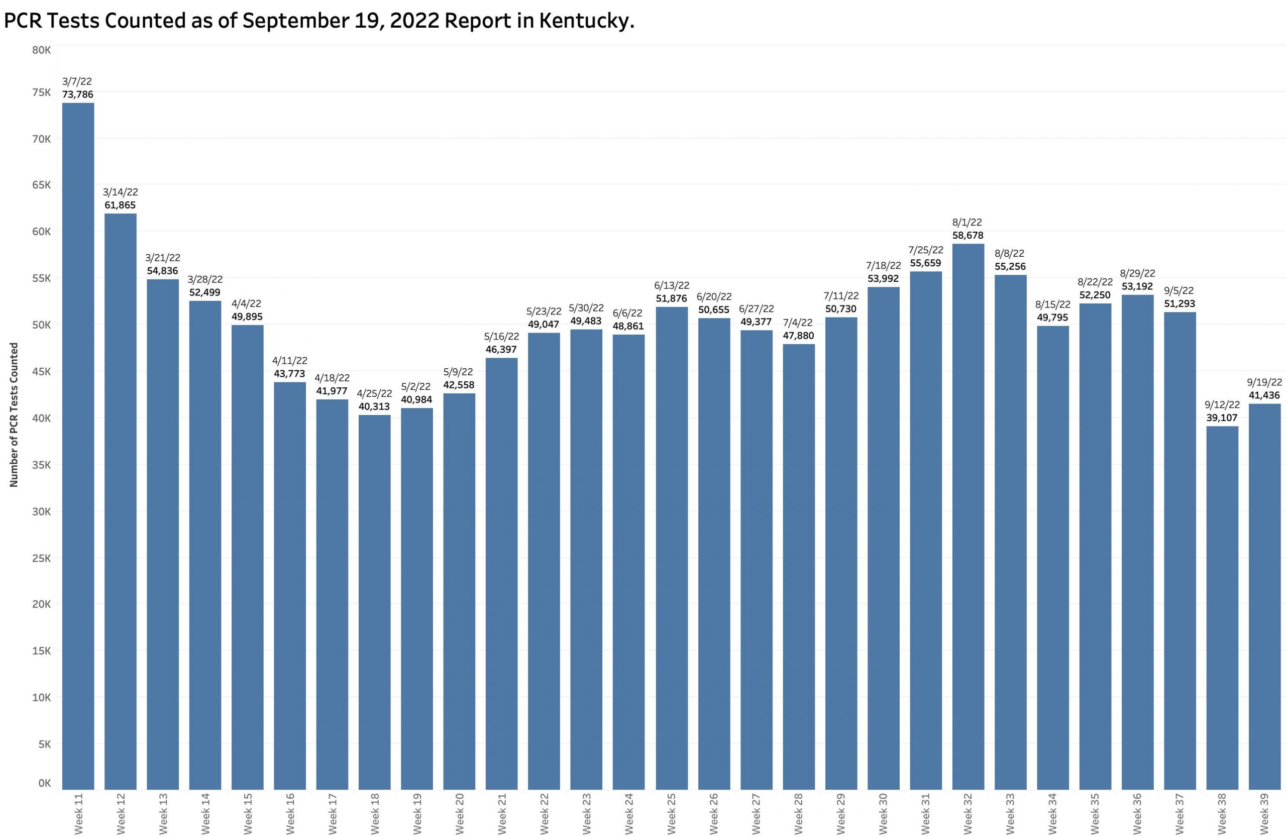
It has been calculated this way for well over a year and has the advantage of simplicity, timeliness, and consistency. It is a simple ratio of the number of Covid-positive results to the number of PCR tests performed. However, not all tests are included in the calculation– only PCR (viral RNA) tests performed by laboratories that report their results to the state electronically. This means that vast numbers of positive tests such as from non-electronically-reporting labs, antigen testing at home or elsewhere, or clinically diagnosed cases are left out of the calculation. The TPR calculated in this way has correlated very well with the number of new cases over the past 2 years. In recent months, this version of TPR identified an average of 60% or more of the number of cases categorized weekly as “new.” Over the previous 4 weeks 70 to 80% were identified in this way but dropped dramatically this week to 54%! The total number of PCR tests performed (both negative and positive) increased very slightly in this current reporting week from 39,107 to 41,436 but this number remains substantially lower than the counts of the proceeding 3 or 4 months (See figure below.) The combination of a low number of selected PCR tests being reported and a lower Test Positivity Rate should have led to a lower number of new cases from this source. Where did the other 4205 “new” cases come from?

“Uncounted” New Cases.
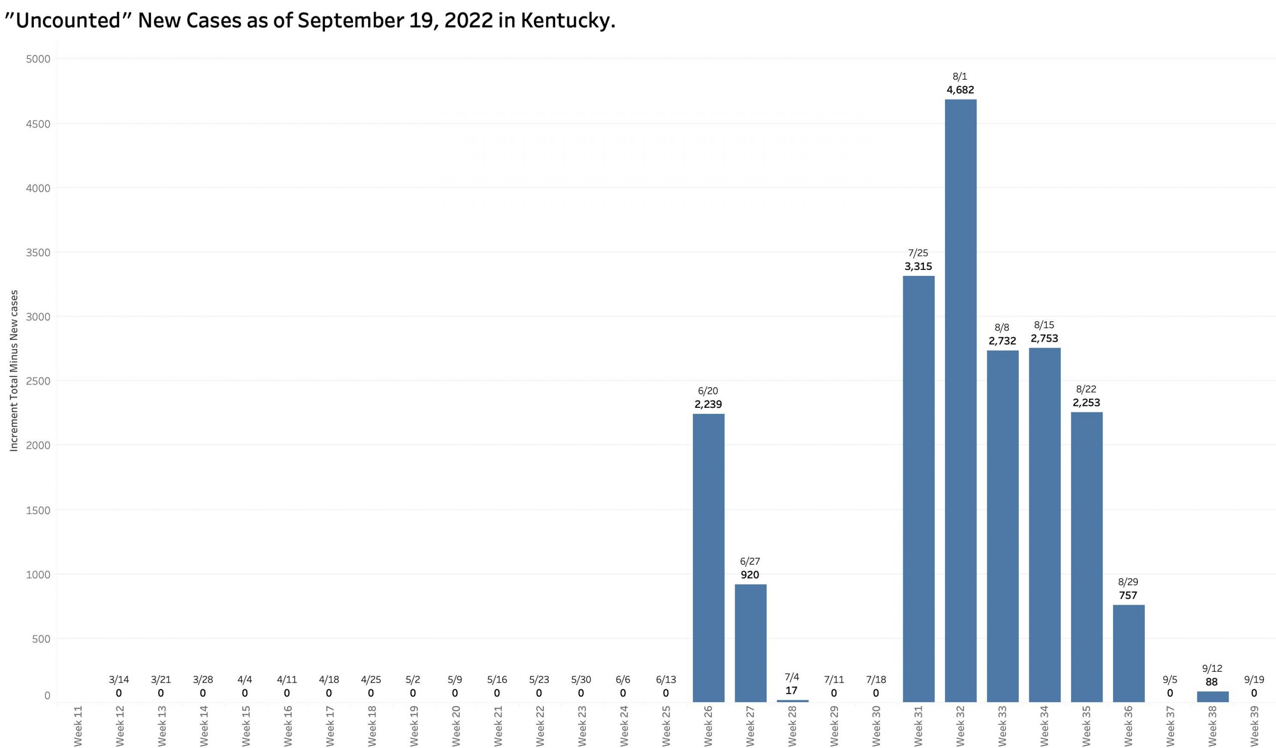
In 10 of the previous 13 weekly reports, the increment in the number of [aggregate] Total Cases increased by amounts larger than the number of New Cases reported for that week. I referred previously to such cases as “uncounted.” I assumed that in part these included “catch-up” cases whose onset of disease occurred well before the cutoff date of each weekly report. In fact, my assumption was confirmed by an annotation by KDPH attached to its reports: “Cases reported more than 30 days after occurrence are included in cumulative totals only.” The delay in reporting is an obvious example of the archaic public health systems we work with nationally and in Kentucky. (A similar phenomenon occurs with deaths as large boluses of numbers work their way through the belly of the python that is our complex death-reporting system.) In this most recent week’s report, the increment in total cases matches exactly the number of new cases. We must assume there have been more new infections than we know about at this time.
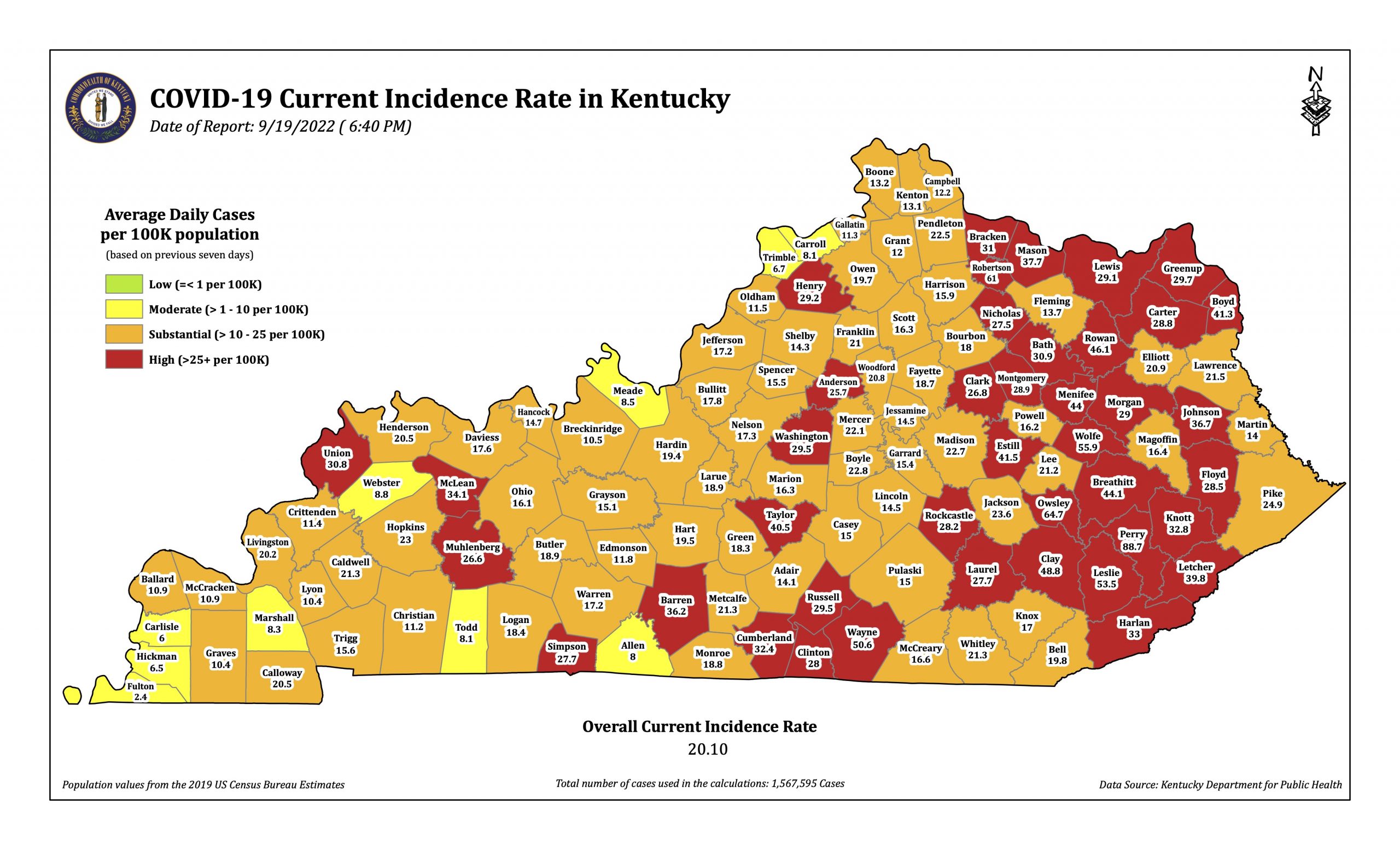
“Incidence Rates are defined with slightly different different language by KDPH on its reports and maps. For the table of “Incidence Rates By County,” it is the “Average daily new cases per 100,000 population based on previous seven days.” For the weekly “Covid-19 Current Incidence Rate in Kentucky” published Monday evenings is a fuller description: The seven-day incidence is calculated by taking the total number of unique cases in each county over the past seven days, divided by seven to get a daily average, divided by the U.S. census bureau county population and multiplied by 100,000 to get the incidence per 100,000 people. The cases counted each day are based on the date an investigation was opened in the National Electronic Disease Surveillance System. Duplicate cases are removed before the calculation, so each positive case is included only once.”
The Overall Current Incidence Rates printed on the table and the map are identical. This week’s reported rate is 11.73% per 100K, down 25% from the previous week of 26.97 and by nearly 50% from the 39.72% per 100K in the report of September 5!
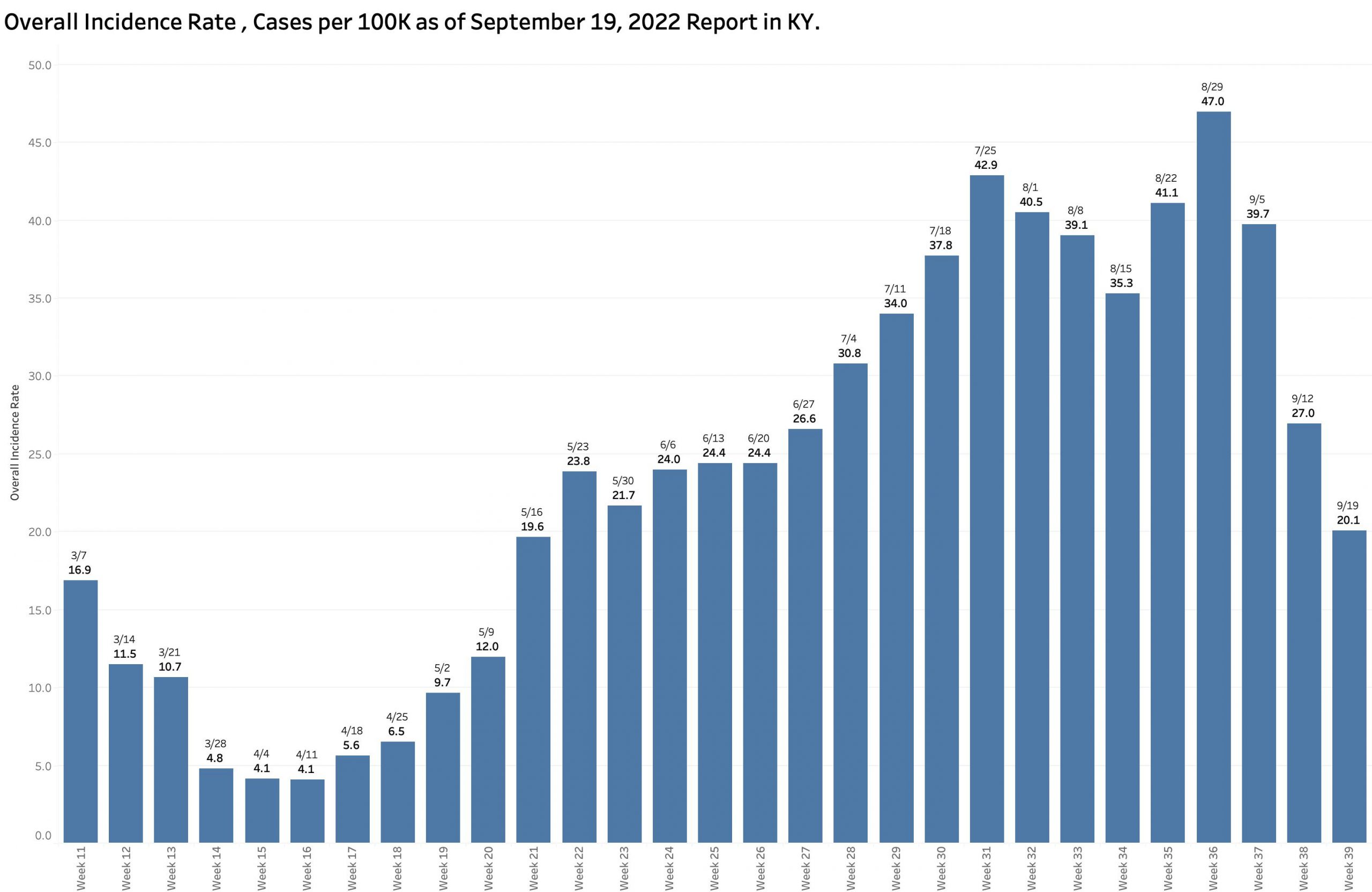
The published Overall Incidence Rate has indeed dropped dramatically. So has the number of counties “in the red” (defined as those with a county incidence rate greater than 25 per 100K). The number of red counties tracks closely with overall incidence rates. The number of “high” red counties in the last 4 reports has decreased sequentially: 104, 97, 65, to the current 41. Interestingly, the number of red counties in the most recent “Community Levels by County” map of the CDC was 45. In both maps the large majority of counties with these higher incidence rates are in eastern Kentucky– some very high. The current New York Times analysis of the states assigns Kentucky a 7-day average case incidence rate of 28 per 100K in a three-way tie for highest in the nation with West Virginia and North Carolina.

Absent the historical raw data by county and any daily numbers at all, I do not at present understand an apparent discordance between the number of cases, test positivity, and incidence rates. For example, with respect to incidence rates, the number of new cases this last week hardly changed at all from the week before and the population of the state is essentially unchanged but the incidence rate dropped bigtime. The answer probably lies somewhere in the weeds of how terms are defined and the day-to-day mechanics of how cases come to the attention of the public health departments, how long it takes for local agencies to report centrally, how long it takes to enter the data into the state’s and the CDC’s analytic systems, and how long it takes to publish the results. To my eye it is clear the path is tortuous, loses much information, and takes too long to be as helpful as it needs to be.
Other Metrics in the Current Report:
Current hospital census is nominally down from 584 to 456, as is ICU and ventilator utilization. How many of these actual human beings are in the hospital because of Covid or admitted for other reasons with an incidental positive test is unknown. The death count is back up to 80 per week, slowly rising since July, but much lower than the nearly 300 to 150 or so in March through early May.
To conclude this interim analysis, I want to take the optimistic position that Kentucky’s part of the pandemic is on average throughout the state simmering down, but when it started, how fast it is changing, and where it is going is not yet as predictable as I would like before we abandon all the simple things we can do to mitigate the ongoing significant damage to our collective physical persons and pocketbooks. It is obvious that in some parts of the Commonwealth that the Coronavirus is still having its way with us. We are as a whole no safer or healthier than the sickest in our midst. That is the principal that underlies the whole concept of public health. What happens in one county does not stay there.
Peter Hasselbacher, MD
Emeritus Professor of Medicine, UofL
22 September 2022