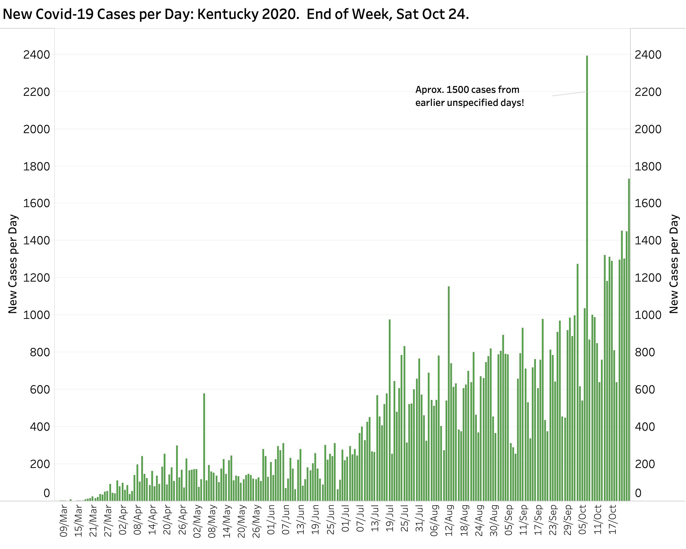
I should be no surprise to readers that Covid-19 has entered a new and rapidly expanding phase of its presence in Kentucky. It is no longer (and never has been) solely a threat to the larger urban centers of the Commonwealth. Lack of a national strategy, conflicting advice, and poor example from some political leaders has made matters much worse than they had to be. I have been updating KHPI’s Covid-19 tracking page daily and will close out the past week of new record highs with additional commentary Saturday evening.
Watch Covid-19 spread ‘live.’
I want to take this occasion to augment yesterday’s offering to test a newly learned capability of the Tableau software I have been using for its powerful database, statistical, and data visualization capabilities. Using the New York Times Covid-19 County Database, I previously offered static maps that displayed the aggregate number of cases and deaths in each of Kentucky’s 120 counties at a single point in time.
What I have now been able to do is assemble a “filmstrip” of daily maps with a map for each of the 216 days since Covid-19 was first recognized in the state. The result is posted on the KHPI Tableau Public website. Using the date slider control in the panel on the right, the viewer can select any date interactively. There are also buttons (Back-Stop-Forward) to automatically transition one way or the other, but unfortunately on this browser-based platform, the rate of change is rather slow. (The image below is for illustration purposes only. Not a link.)
Continue reading “Serial Map Display of Spread of Covid-19 Across Kentucky.”