How will we know when we have won?
[Addendum: I have updated the Tableau Pubic presentation with data from Friday April 17. The increase in cases and deaths was not as great as the Governor feared. It looks to me like the rate of increase in both cases and deaths no longer fits an exponential trend curve. Things look like they are slowing down! Overall however, both measures continue to increase. I will address this new data later.]
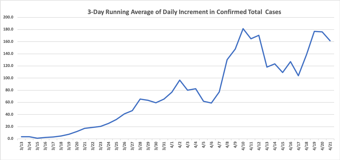
I have been tracking and commenting on the number of cases and deaths from Kentucky’s coronavirus epidemic. Despite my best effort’s and some requests, the only data I have from Kentucky proper is what has been announced from the governors office during his evening greetings. Given our national slow start in timely testing for the virus, we must assume that the numbers as presented are incomplete– indeed only the tip of the iceberg. We have been warned over the past two evenings, that as data collection is now more systematized, that tonight we should expect a large number of “catch up” cases. For that reason I have not yet updated the numbers in my earlier articles or on my Tableau Public website.
In the meantime, I have been evaluating further the approaches I have been using to visualize the numbers released. Because we are still in the exponential expansion phase of this epidemic and because of some unavoidable scatter in the data, it is very difficult to determine if we are bending our new-case curve, let alone flattening it. It is certain that we have not yet reached the peak incidence of this epidemic.
Are we bending our curve yet?
When a curve on a simple graph plot is going straight up, it is difficult to know when it will stop. For this reason, I have begun using what is called a semi-log plot that allows simultaneous visualization both high and low numbers, and transforms an exponential curve into a straight line. This is a technique used by experienced epidemiologists (of which I am admittedly not one). In doing so, I wanted to feel more confident with the significance of the observation that the data-points of both new cases and deaths from earlier this this week appeared to be falling below the predicted trend-line. That would be nice! There are lots of understandable reasons why that may not be happening including more testing, clusters of deaths in long-term care facilities, more impatient violations of large group gatherings, and the like.
My goal here.
While I am waiting for tonight’s updated numbers, I wanted to try some alternate methods of visualizing the data and get a feel for how reliable they might be in identifying and impact of what we are all trying to do together. I am feeling more confident that using semi-logarithmic plots and applying exponential regression analysis can be useful in identifying trends. Because I find that experts commonly, if not by standard, exclude cases before the 100th when attempting to predict the future. (Early data may be collected in a less formal manner and the randomness inherent in low numbers may offer less predictive value.) I placed a presentation on my Tableau Public website that steps through my thinking. This is what I expect to try in future articles.
Even with all the caveats.
Looking at the various plots and making assumptions about how infectious agent like Covid-19 might be, I was stunned (but should not have been) at the power of exponential (compound) growth. I start from a single case from a hypothetical virus and uses purely hypothetical data. Even if a single infected person passes the disease to only one out of a thousand other people, the number of new cases in Kentucky would be in the tens or hundreds of thousands within 40 days. In addition, I am impressed at how fast things can sneak up on you!
Continue reading “Tracking Kentucky’s Covid-19 Epidemic”